On Sunday, September 17 at SCHEELS Home & Hardware, 14 North Dakota State interior Design students split into 5 teams for the 6th annual Interior Design Challenge sponsored by Trendsetters magazine and SCHEELS Home & Hardware, an exclusive competition designed to spotlight the incredible talent within their Interior Design Department! With just four hours to bring their designs to life, this annual event provides aspiring student designers with an unparalleled opportunity to showcase their creativity, technical skills, and passion for transforming spaces. With an emphasis on innovation, functionality, and aesthetic brilliance, this challenge encourages judges, participants, and magazine readers alike to push the envelope and redefine the norms of interior design.
Let’s see what the students came up with!
Meet the Judges

Looking to spruce up your living space or change a style? We offer a variety of different vendors that have the ability to completely customize your upholstered furniture needs. Two of our most popular vendors include Craftmaster and Rowe Furniture. They both offer performance fabric options and leather options. Performance fabrics are highly recommended to help extend the longevity of the clients furniture investment. Especially for families with kids and pets! The process of selecting and customizing a furniture piece or grouping begins with meeting one on one with one of our Interior Designers or home accent consultants to review the needs of your home or business. Whether that be with your construction documents, a sketch of your own floor plan, or even being at your home with you to help execute the best use of your space. Our experts are here to help coordinate colors and furniture styles to be cohesive with your existing furniture and home. -Leah Martin SCHEELS Design Studio Interior Design
Bohemian Style
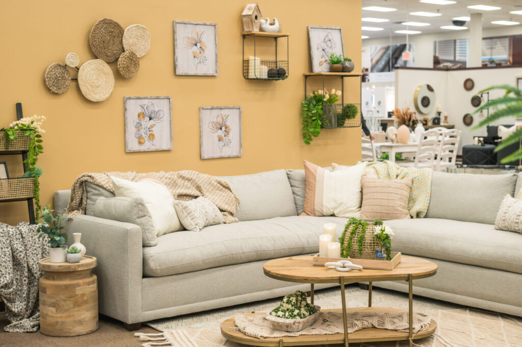
The Bohemian room, curated by Melina Clements, Kayle A. Farran, and Boone Morrow, is a testament to the free-spirited and eclectic nature of “Boho” style. Melinda Clements, one of the creative minds behind the design, describes the style as, “Bohemian. It’s a lot of natural and light colors. It leans heavily into nature and feels a lot more organic.”
The room is a harmonious blend of rich, vibrant colors, earthy browns, stabilizing grays, and accenting greens. A delightful interplay of warm tones with cool, unexpected splashes of color bringing the space to life. The furniture is a diverse mix, combining antique and vintage-looking pieces with more modern ones. As Melinda notes, “We didn’t know what coffee table to have initially. Then we found this one, and it really feels like it’s pulling the space together.” Layering is a defining feature of this Bohemian style. Patterned rugs overlap and a plethora of throw pillows in varied textures and patterns grace the seating areas. Melinda emphasizes the importance of these details, saying, “A lot of it is honestly pillows and blankets. They make it feel so much more homey and cozy. Just before starting, I was grabbing another blanket because we need at least two, and we have about six different pillows on our couch.”
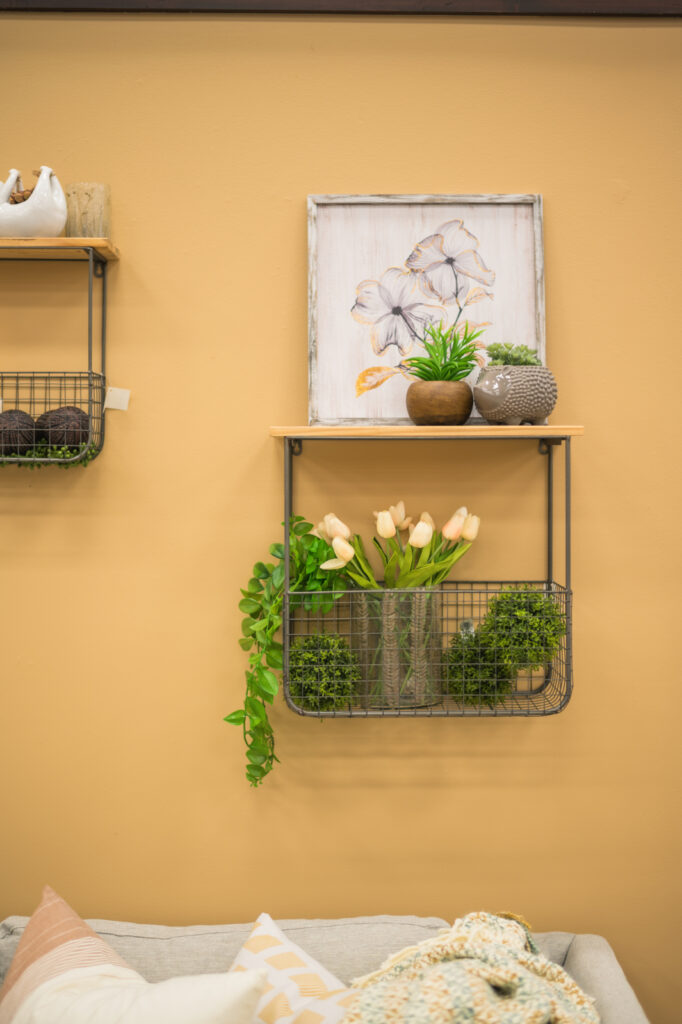
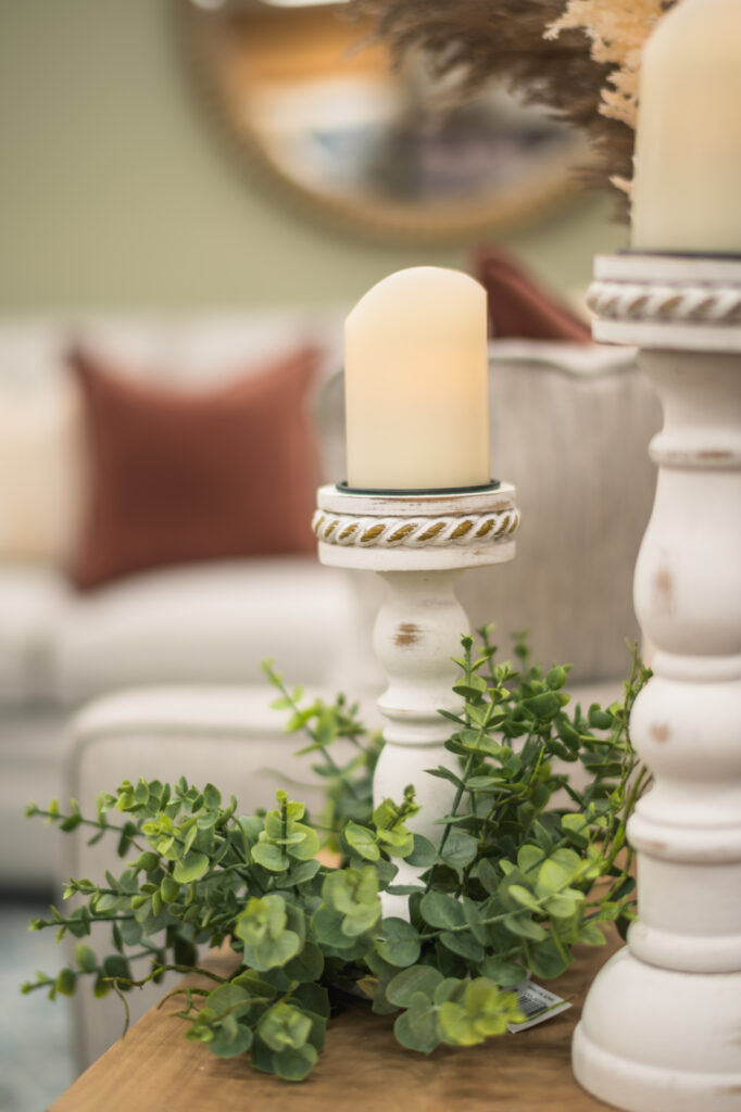
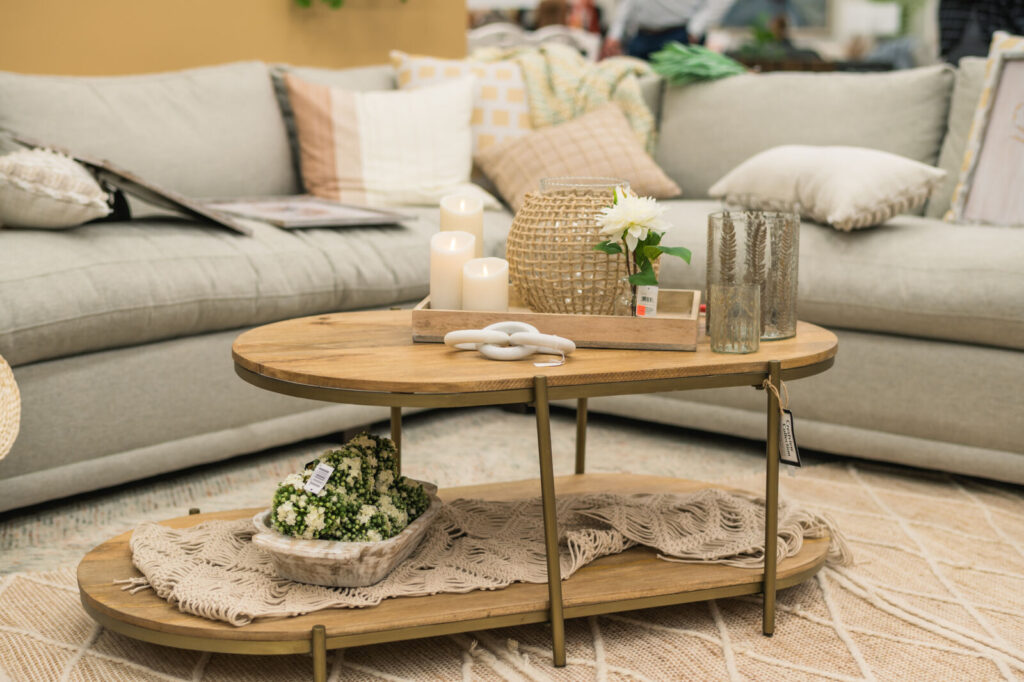
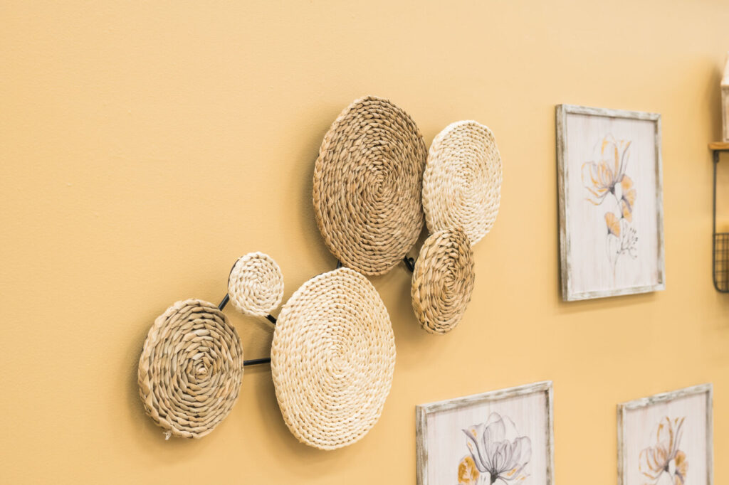
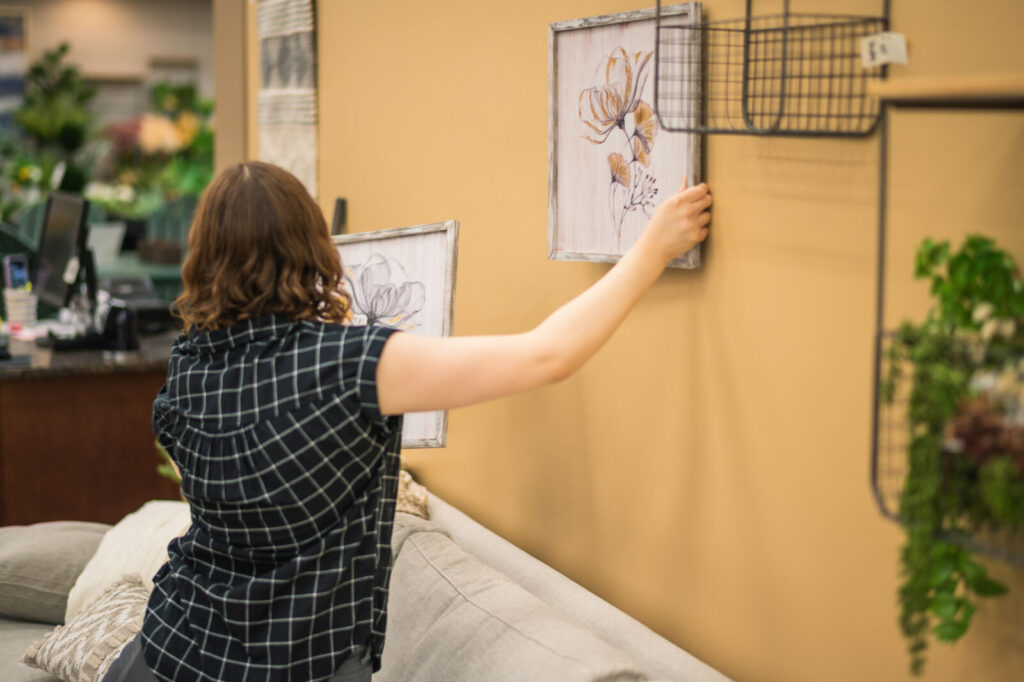
The room is not just about aesthetics; it’s about creating a feeling. Designed for those who desire their homes to be brimming with life, culture, and intriguing items, this Bohemian aesthetic challenges modern sensibilities, embracing the carefree, relaxed, and unique. Drawing heavy influence from the 1970s design, it encapsulates a casual, collected ambiance. Further enhancing the room’s charm are various knick-knacks and plants in mismatched pots, introducing a touch of nature. Candles, when lit, would cast a warm, atmospheric glow, making the space even more inviting. The room’s layout is informal, with furniture arranged to promote conversation and community.
In Melinda’s words, “It definitely came together differently than what I originally imagined, but it came together well.”
The Bohemian Team
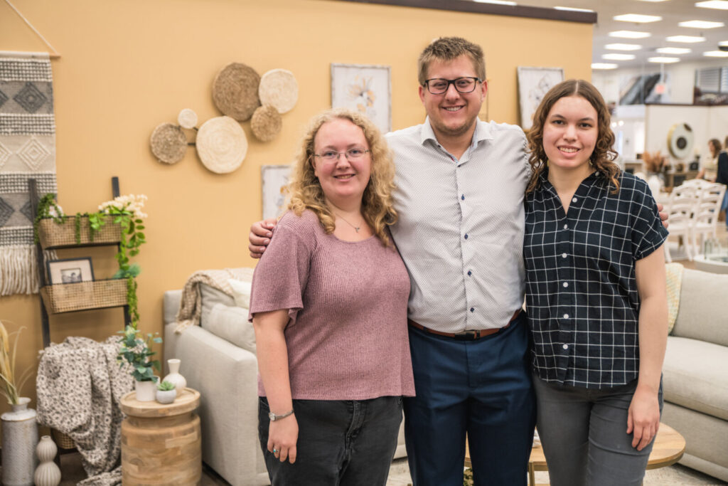
Melinda Clements, Senior
Inspired By: “People and nature and the influence that both have on a space. I’m also inspired by the desire to see the final product of a project.”
Boone Morrow, Senior
Design Style: “Clean with pops of bold colors.“
Kayle A. Farran, Senior
Inspired By: “People’s stories and the goal to create spaces that allow people to live out their best life. I enjoy designing for overall health and wellness and considering the different challenges individuals may be facing when laying out
a space.”
Lakes/Coastal Style
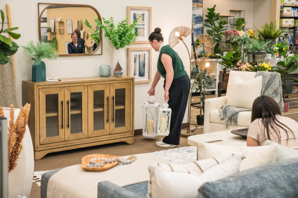
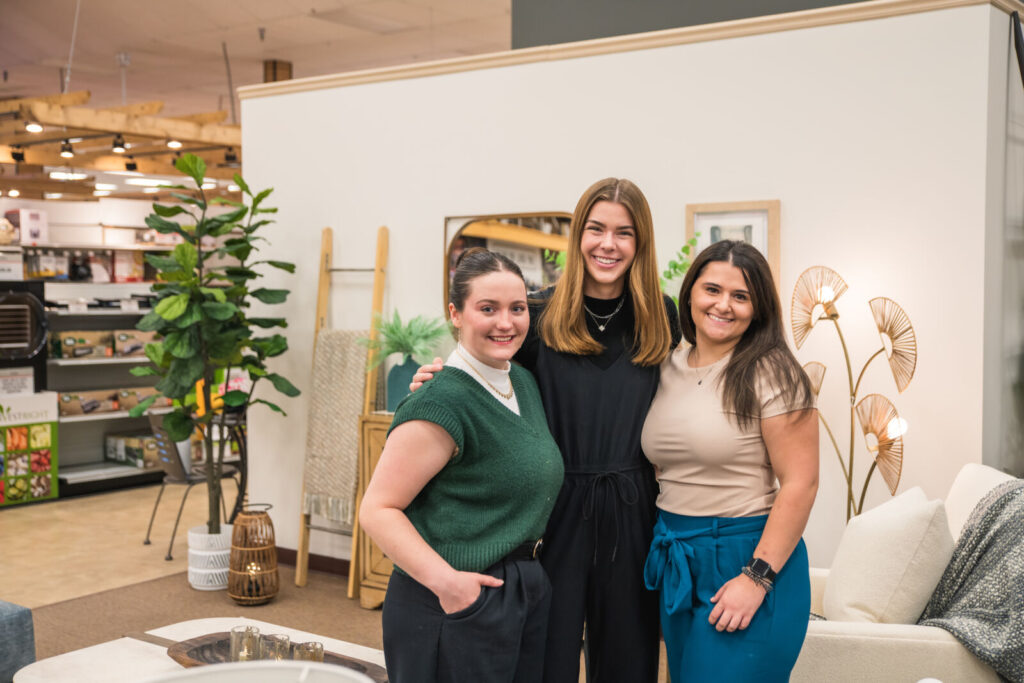
The Lake/Coastal style living room, meticulously crafted by Katelyn Christine Lamb, Erin Dorothy Morris, and Emma Sycks, is a serene reflection of the tranquil beauty of lakeside and coastal landscapes. When talking about the design process, Katelyn said, “We had a budget to purchase some key items for the design challenge. We chose a rug and a lamp that we felt would tie the room together. Rugs and lighting can make or break a design, so we were particular about these choices. The couch, with its muted bluish-green hue, reminiscent of teal, was another piece we felt would perfectly encapsulate our theme.”
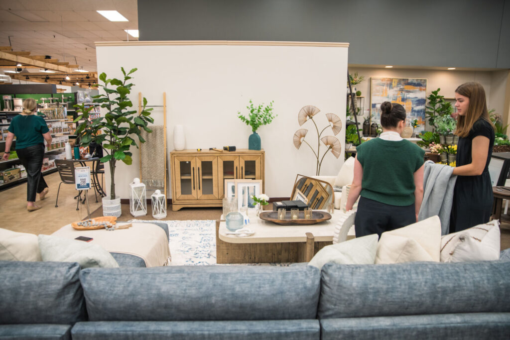
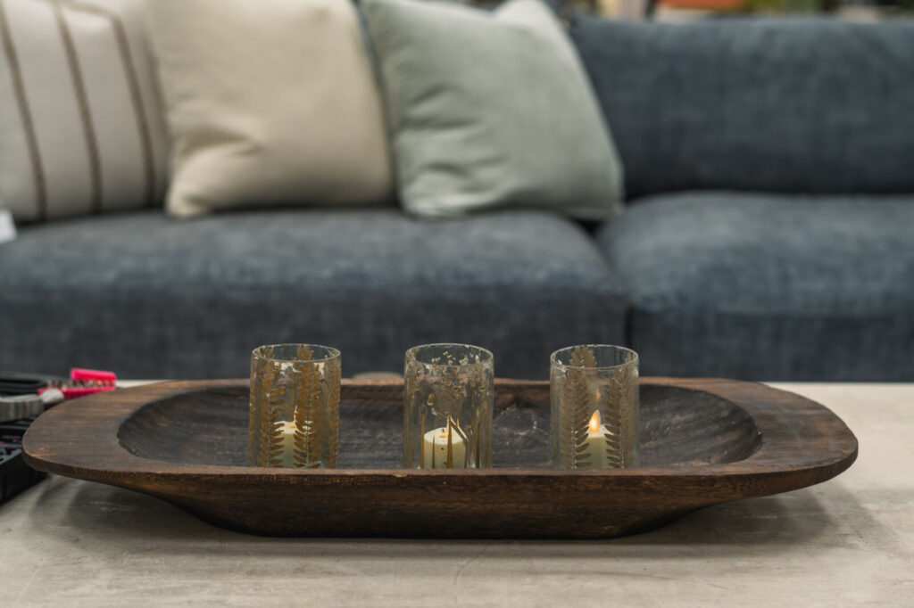
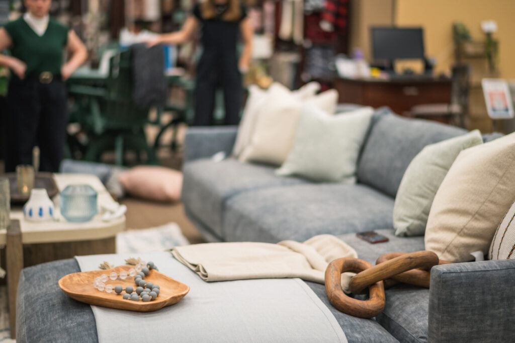
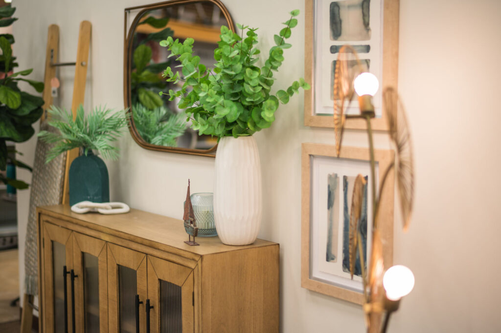
The color palette is a harmonious blend of the sea and sky, featuring soft blues, sandy beiges, crisp whites, gentle grays, and the vibrant green of plants. Katelyn elaborated on the inspiration behind the color choices, “When you think of the lake, you envision the brightness of the colors, the warmth of the woods. We wanted to balance that out. We initially aimed for creams or whites, but after some consideration, we leaned towards lighter blues and sage greens.”
The room’s centerpiece is its sofa, as blue as the pristine waters of a tranquil lake. Complementing the sofa are throw pillows and cushions in shades of white, enhancing the room’s natural, airy ambiance. Katelyn added, “It’s like a blue sky and beach day. The colors, combined with the warmth of the woods, create a perfect balance.”
In Katelyn’s words, “The design is a reflection of a beach day, capturing the warmth, brightness, and tranquility of lakeside and coastal settings.”
The Lakes/Coastal Team
Katelyn Lamb, Senior
Inspired By: “Layered, contrasted, colorful, and interesting.”
Erin Morris, Senior
Design Style: “Definitely leaning more contemporary. I like clean lines, use of geometric pieces, natural light, and stark contrasts!”
Emma Sycks, Senior
Inspired By: “People-Centered Design—providing spaces that make people’s lives easier and better functionally, mentally, and socially. “
Ranch Glam Style
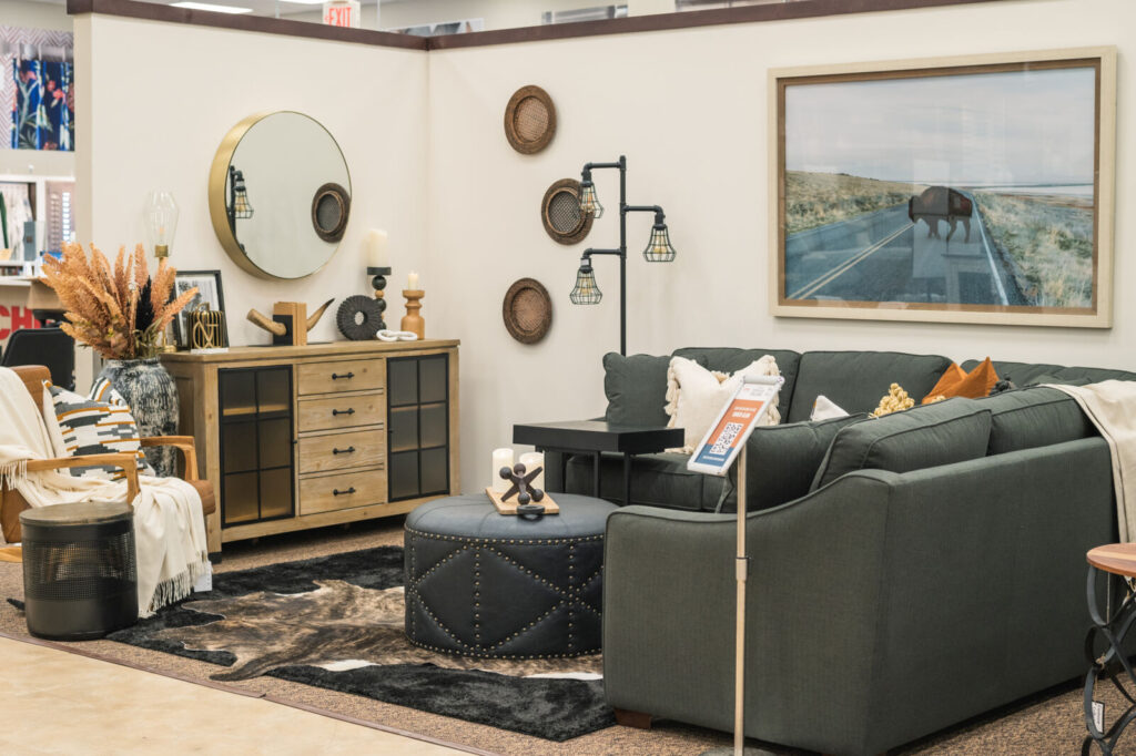
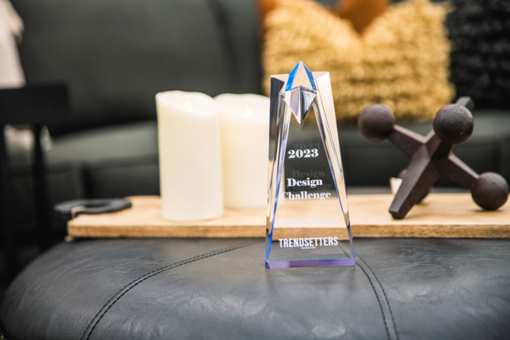
The Ranch Glam living room, masterfully curated by Kenna Smith, Kylie Dew, and Joslyn Sweson, is a harmonious blend of southern elegance and rustic charm, deserving of their award as Judges Choice..
“Ranch glam is our take on a more southern style, distinct from the typical farmhouse,” Joslyn said. “It’s a modern interpretation of the rough textures synonymous with ranch life, emphasizing natural stone and wood.”
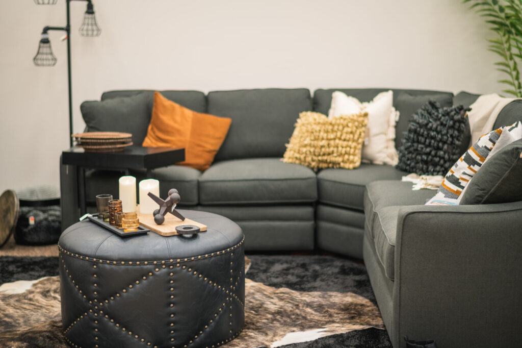
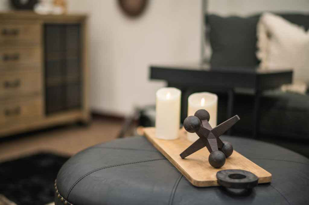
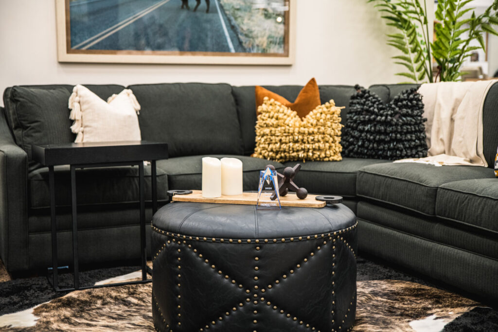
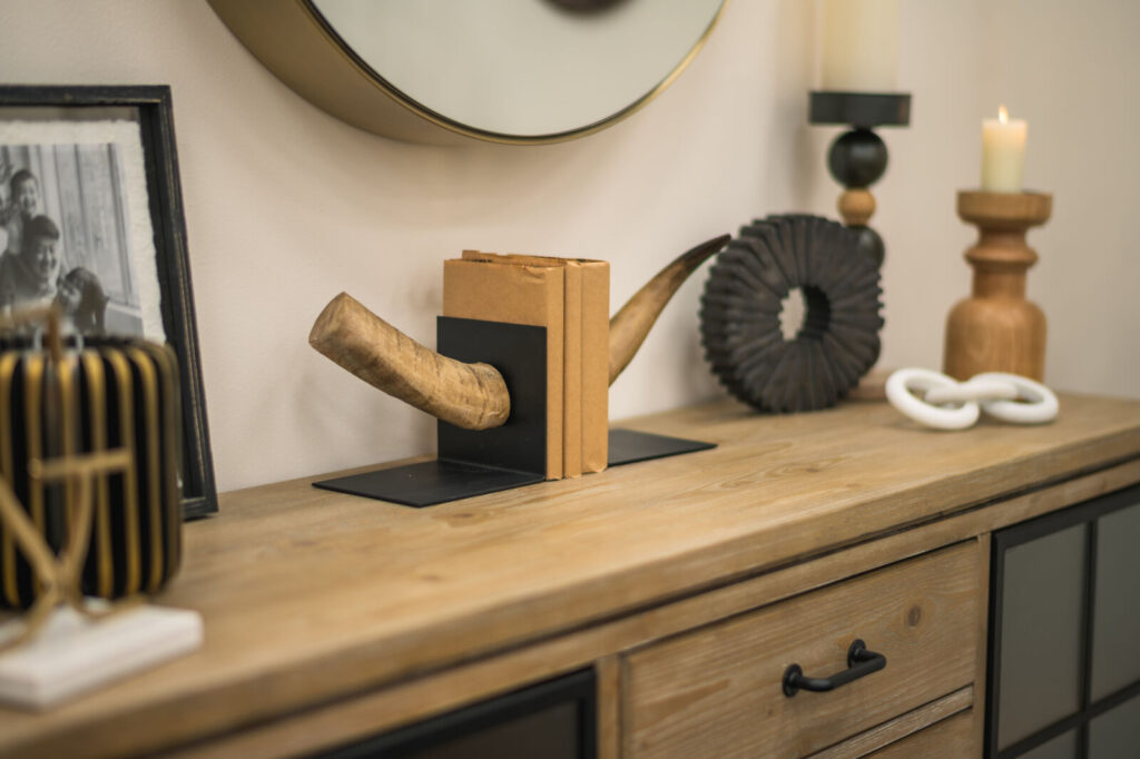
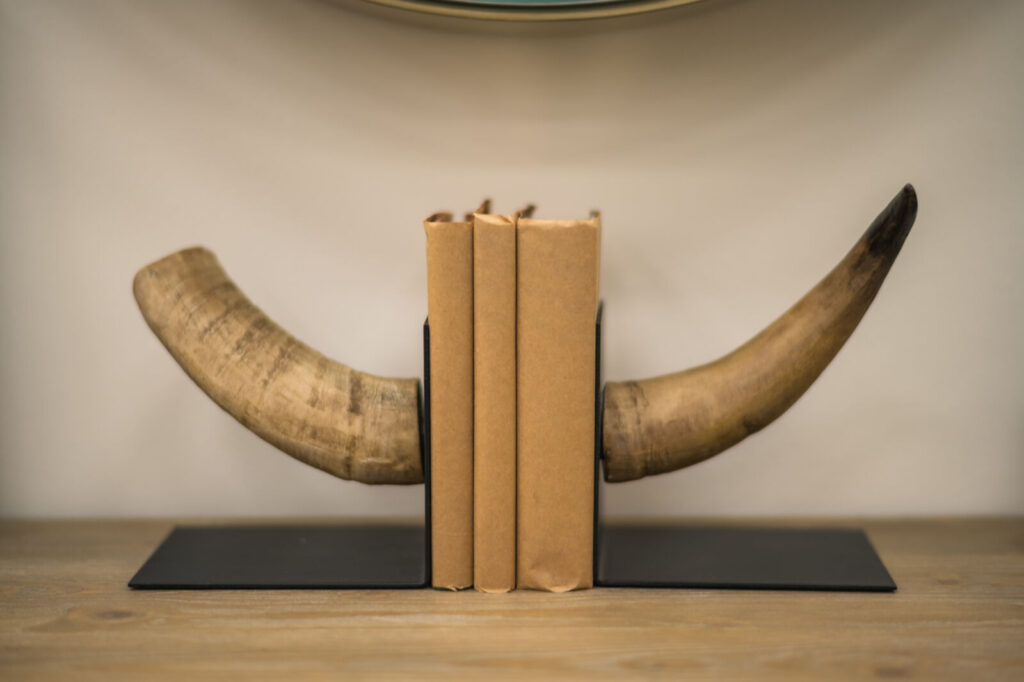
The essence of “Ranch Glam” lies in its approachable elegance. It layers texture over color, resulting in a design that’s both modern and rustic. The style seamlessly integrates wood with metal, striking a balance between farmhouse authenticity and modern glamour. Joslyn elaborates, “It’s about mixing streamlined elements with unfinished ones. Clean lines make a space feel sophisticated, but when paired with unfinished elements, you achieve that perfect balance.”
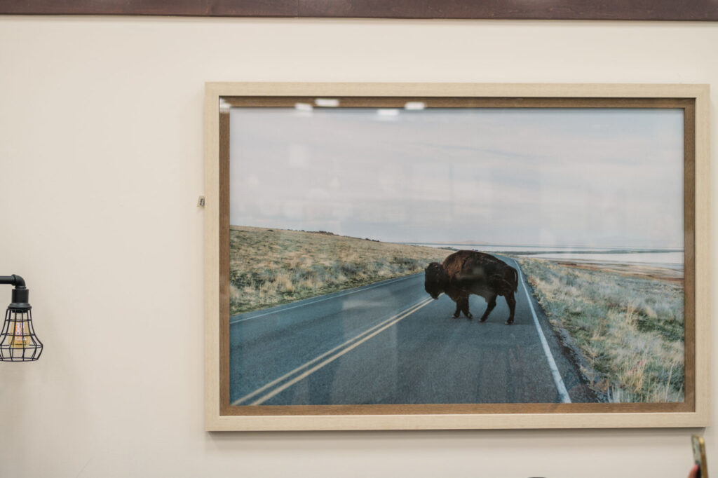
The room’s color palette is anchored in black, complemented by earthy tones like rich browns, tans, and creams. These hues craft a warm, inviting foundation, sprinkled with hints of sophistication. The furniture choices further accentuate the theme. A dominant rich charcoal sofa takes center stage, offering both comfort and style. The Bison painting, a nod to North Dakota’s heritage, graces the wall, encapsulating the ranch spirit.
“Ranch Glam is chic yet cozy,” Joslyn said. “Imagine pairing a live-edge wooden coffee table with an elegant white sofa. It’s where you can unwind after a day on the range, basking in luxury without losing touch with nature and the rustic simplicity of ranch living.”
The Ranch Glam Team
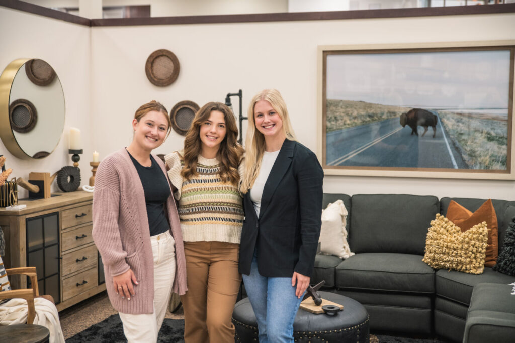
Kenna Smith, Junior
Inspired By: “New and innovative ideas and products.”
Kylie Dew,Junior
Design Style: “Just about anything around me. You can pull ideas from the world
around you and I’m especially inspired by nature.”
Joslyn Swenson, Junior
Inspired By: “I would describe my personal interior design style as a combination of organic modern elements with eclectic/mid-century styles. In simpler terms, I would call it ‘comfortable refinement.’”
Classic Cottage Style
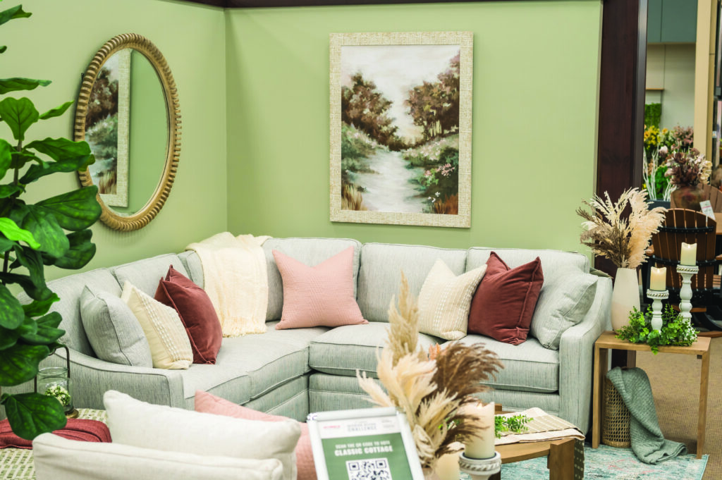
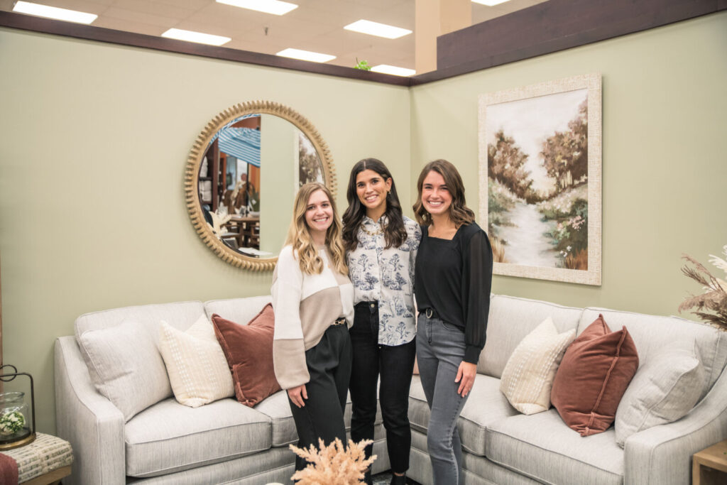
The Classic Cottage living room, thoughtfully designed by Tiffany Holder, Ainsley Vinaja, and Olivia Peterson, exudes a cozy, welcoming ambiance that marries rustic charm with modern elegance.
“Our aim was to transcend the typical shabby chic or rustic look,” Tiffany said. “We’ve infused rustic elements but also introduced modern touches to craft a classy style that has a timeless appeal.”
The Classic Cottage Team won 2nd place in the People’s Choice contest!
Central to the room’s charm is the color palette, which is a gentle blend of muted pastels, sage greens, and creamy whites. These colors, as Tiffany notes, “evoke a sense of simplicity, warmth, and charm, characteristic of cottage living.” The wall, painted in a soft sage green, sets a serene backdrop for the room. A painting that incorporates all the chosen colors ties the room together beautifully.
“Honestly, our painting really brought things together,” Tiffany said. “The color of our wall, a pastel sage green, harmonizes with the painting, creating a cohesive look.”
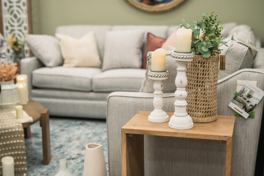
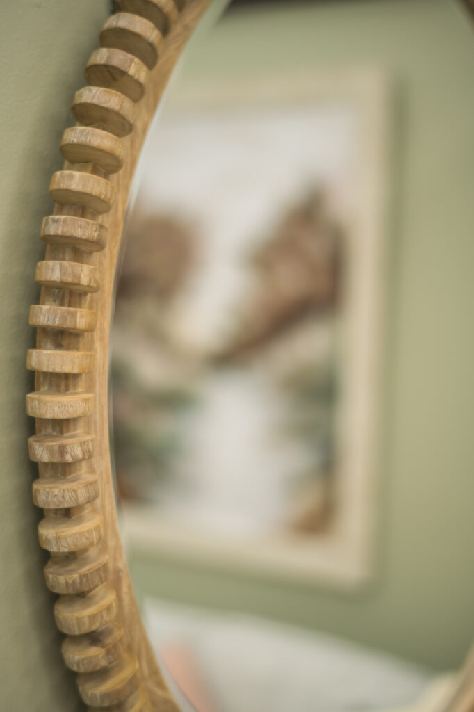
The layout of the room is casual and inviting, with furniture arranged to foster conversation and comfort. This arrangement reflects a lived-in feel, devoid of rigid formalities.
“The Classic Cottage room is like a comforting embrace, filled with personal touches and nods to simpler times,” Tiffany said. “It’s a blend of soft colors, vintage or handcrafted furnishings, and a relaxed arrangement. It’s a space perfect for enjoying quiet moments, family gatherings, or leisurely pursuits. It feels like home, in the most comforting sense of the word.”
The Classic Cottage Team
Tiffany Holder, Junior
Inspired By: “I love many different styles, but I especially love transitional style, which incorporates modern and classic design into one.
Ainsley Vinaja, Junior
Inspired By: “Nature is the biggest inspiration for my
designs since it is so beautiful, powerful, and influential to the human eye.”
Olivia Peterson, Junior
Design Style: “Transitional style best describes my interior design style because of the warm tones, textures, and neutral colors with accent colors and textures I like
to use.”
Scandifornia Style
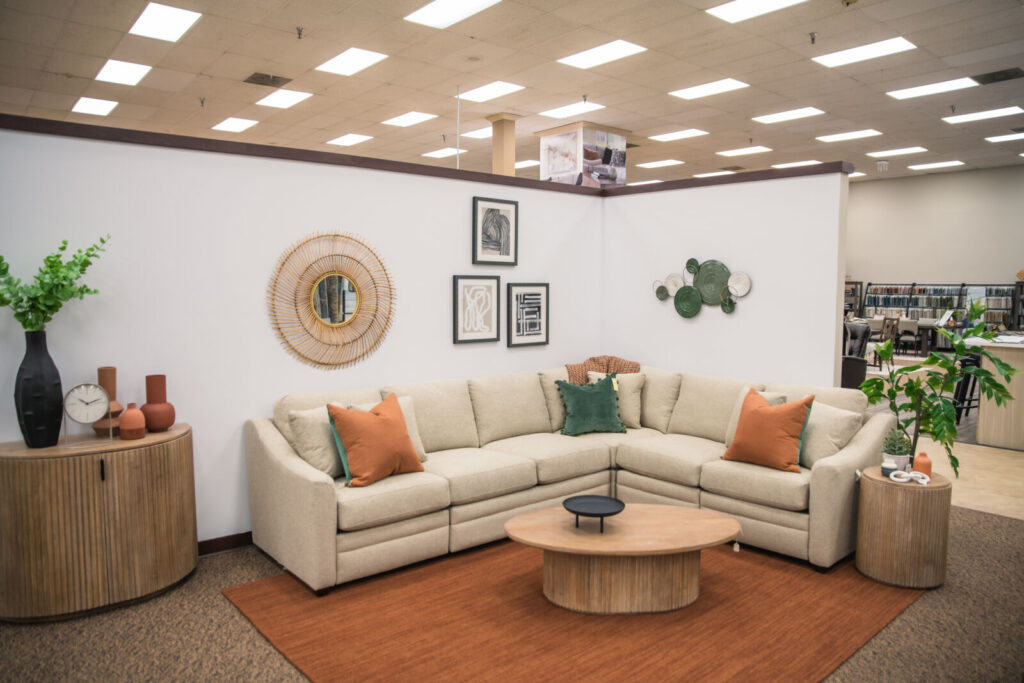
The Scandafornia living room, crafted by Madeline Nelsen and Kendra Ovsak, blends Scandinavian minimalism with Californian elegance.
“We melded modern clean lines with a bohemian beachy, California style,” Madeline said. “A lot of inspiration was drawn from Pinterest.”
The design emphasizes inviting ambiance, organic materials, and comfort, with a color scheme of cool neutrals offset by warm accents.
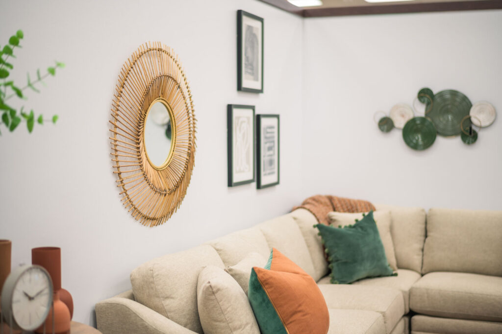
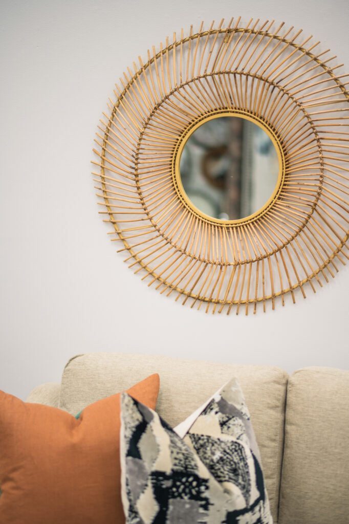
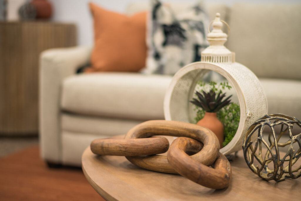
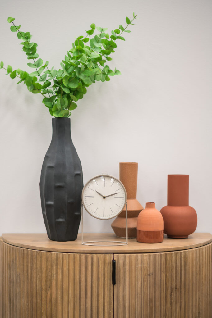
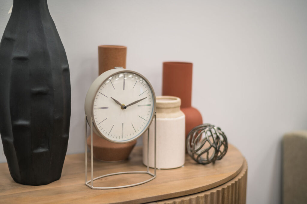
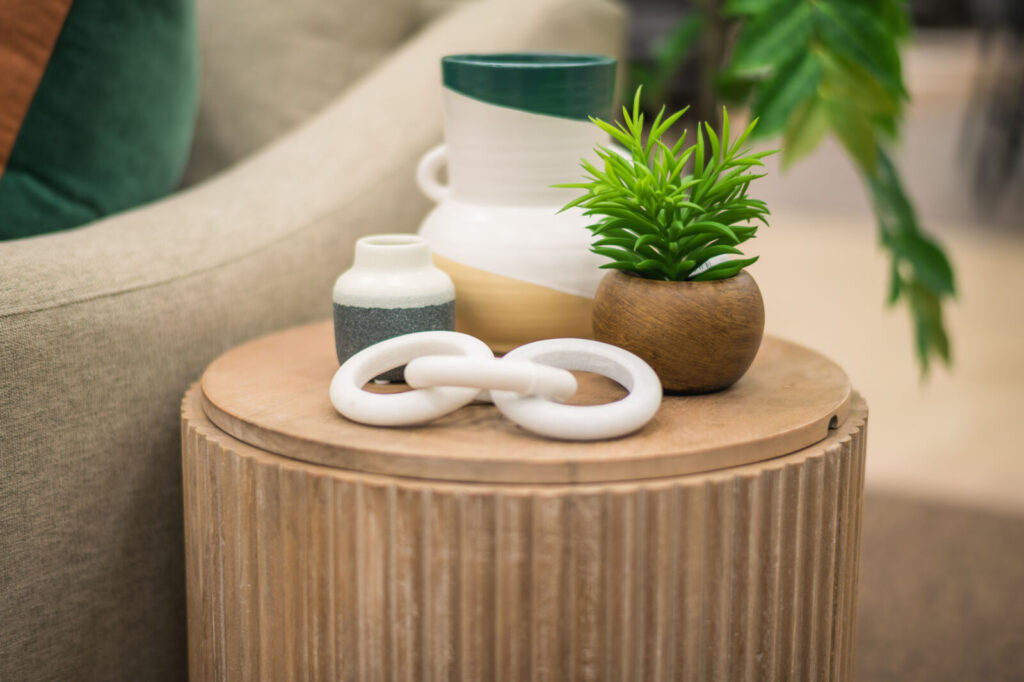
“The palette offers a fresh and cozy backdrop, reflecting Scandinavian simplicity and California warmth,” Madeline noted.
The furniture embodies both design philosophies, with pieces like a light, neutral couch and a sleek coffee table combining functionality and elegance—chosen to resonate with both design influences.
Abstract artwork and mirrors on the walls accentuate the design fusion, enhancing visual interest while maintaining openness and flow. The layout fosters conversation and relaxation, connecting to the outdoors.
“The Scandafornia room exudes calm elegance, where simplicity meets sun-soaked comfort,” Madeline said. “It’s a stylish yet welcoming space that invites enjoyment of life’s simple pleasures.”
The Scandifornia Style Team
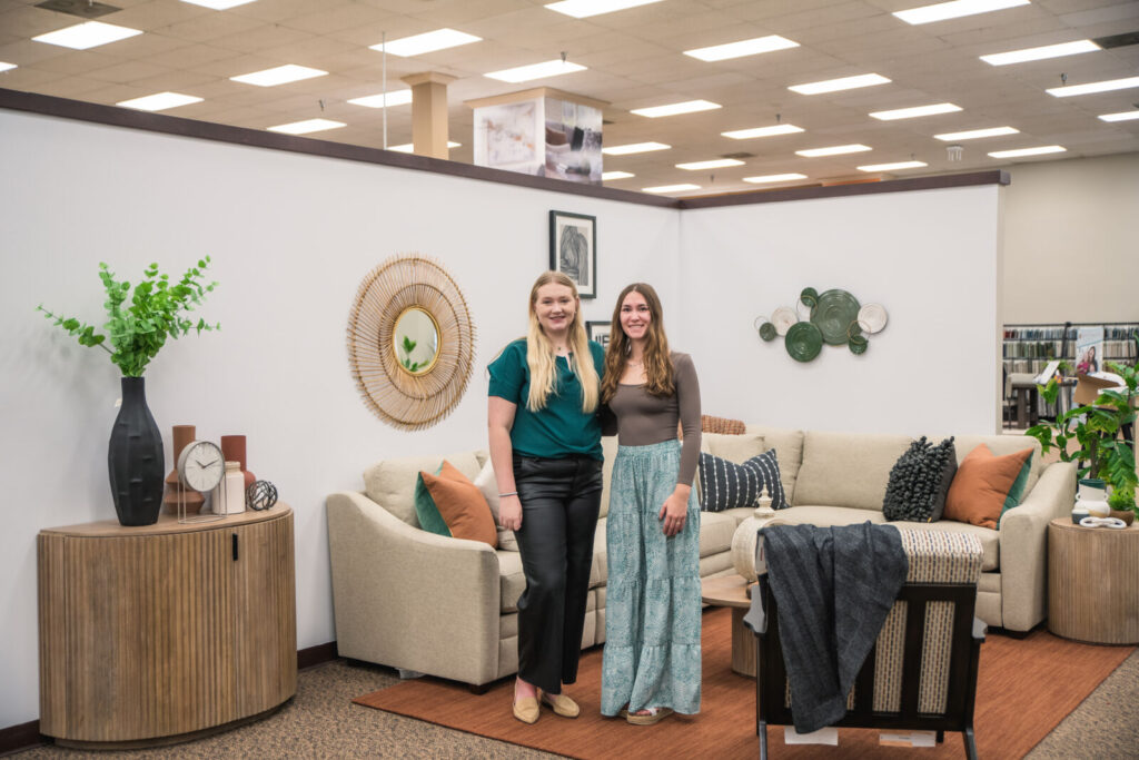
Madeline Nelsen, Junior
Inspired By: “The profession itself. I didn’t begin my college experience with interior design in mind for a career. But after two years of pursuing a degree in biology, I wasn’t happy anymore. After changing my major to interior design, I knew right away that it was the right path for me.”
Kendra Ovsak, Junior
Design Style: “Learning new things. In the interior design world, there is always something new to learn. I want to keep growing as a designer and to do that, I have to step out of my comfort zone. Stepping out of my comfort zone allows me to expand my knowledge and add to my ability to design well.”
The 6th annual Interior Design Challenge sponsored by SCHEELS Home & Hardware has once again spotlighted the remarkable talent within North Dakota State University’s Interior Design Department. Through a diverse array of design philosophies—from the free-spirited Bohemian to the rustic Ranch Glam, the serene Lake/Coastal, the cozy Classic Cottage, and the minimalist Scandafornia—each student team showcased a unique blend of creativity, technical prowess, and aesthetic understanding. Their meticulous attention to detail, thoughtful color palettes, and harmonious blend of textures and materials not only reflect academic excellence but also a passionate pursuit of transforming spaces into expressions of lifestyle and culture. As we applaud the hard work and artistic vision of all participating students, this challenge leaves us with a treasure trove of design ideas and a bright future for the industry.
Can’t decide on which design style is your favorite? Let the SCHEELS design team bring your visions to life. Their design studio offers:
– Hunter Douglas Window Coverings
– Custom Window Treatments
– Paint Consultations
– Wallpaper
– Upholstery
– Space Planning
– Accessorizing
– Furniture Selection and Customization
SCHEELS Home & Hardware
3202 13th Ave S, Fargo, ND 58103
701.232.8903W
Web: scheels.com
Facebook: /scheelshardware


